Karma Sutra
I love this cover for the Karma Sutra. A really nice use of negative space.

I love this cover for the Karma Sutra. A really nice use of negative space.

Paolo Cirio has been making Google Street View into street art. "In the hippest areas for Street Art, life-sized pictures of people found on Google’s Street View are printed and posted without authorization at the same spot where they were taken."
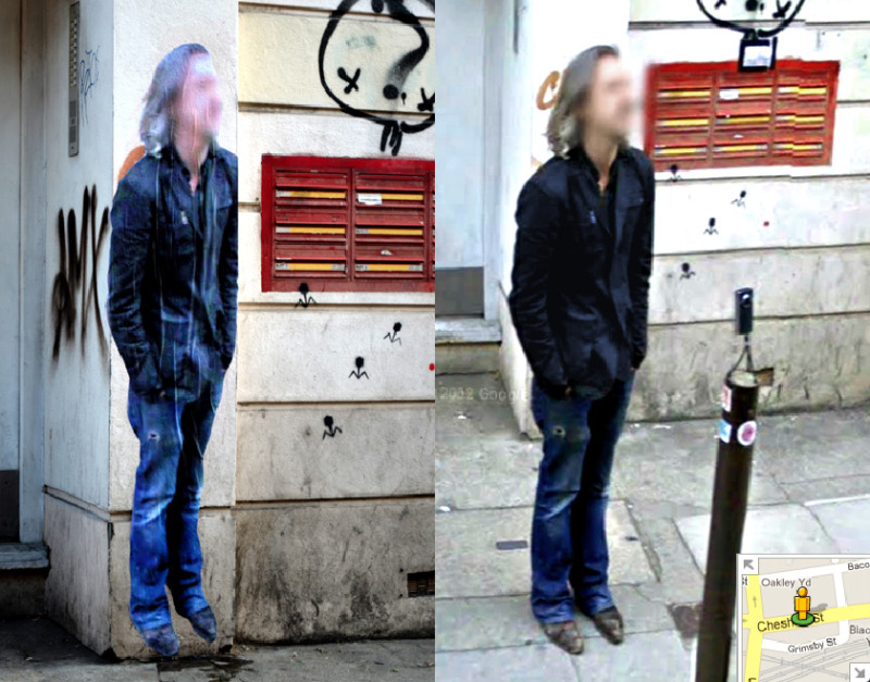
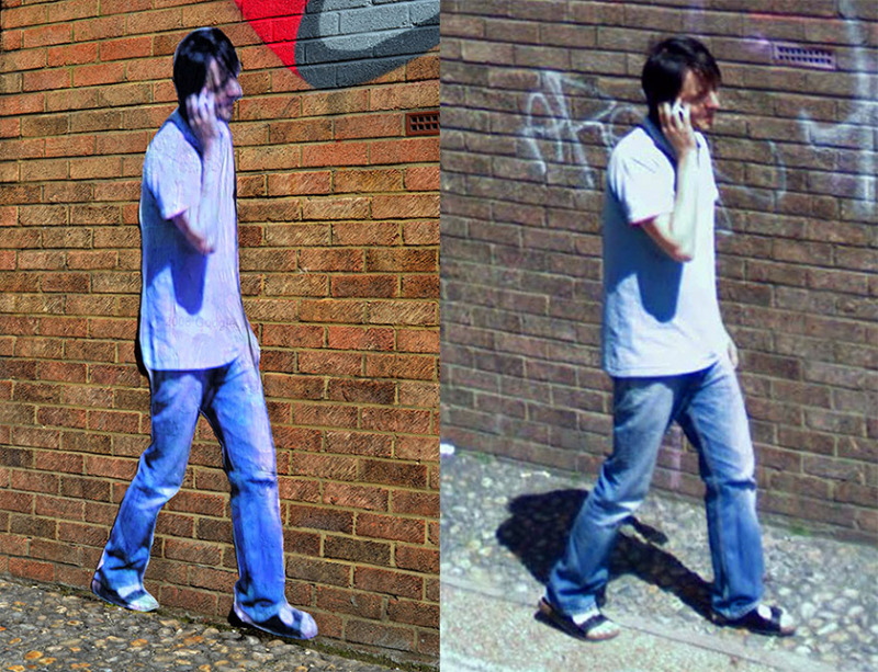
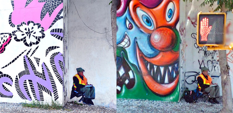
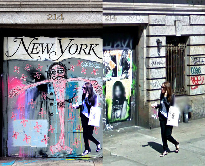
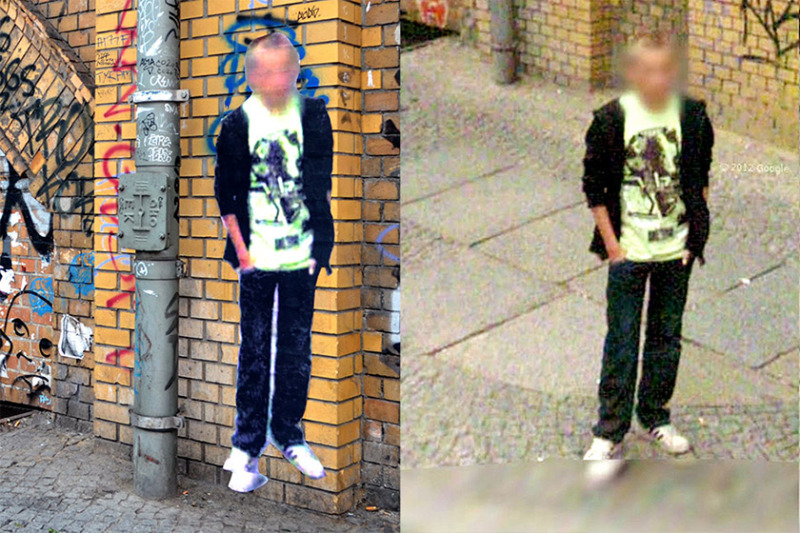
Lots more info over on Street Ghosts.
Via Clare
So today we went to Statens Museum for Kunst, or, The National Gallery of Denmark. They have some pretty cool stuff in there, as well as a lot of 'art' that really gets me going (and by going I mean ranting about what makes art - but that's another story for another time), and today I noticed this painting by Gunnar Aagaard Andersen.

I immediately thought of the London 2012 logo. Is it just me?

Not that it really matters. Everything's a remix and all that, it just struck me as interesting.