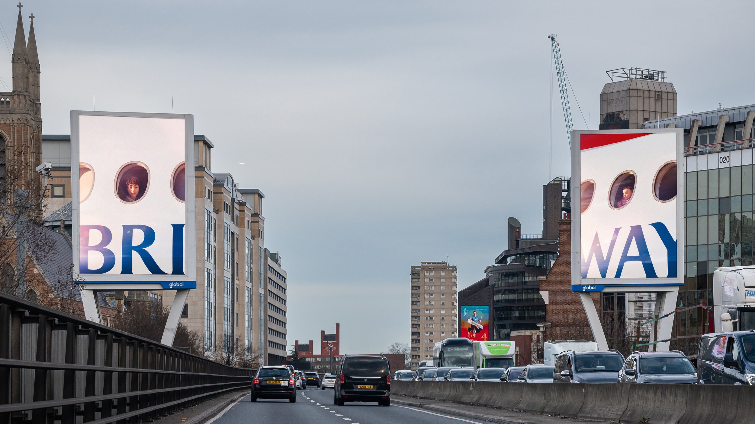
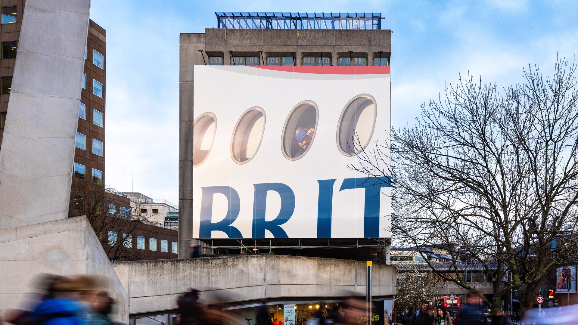
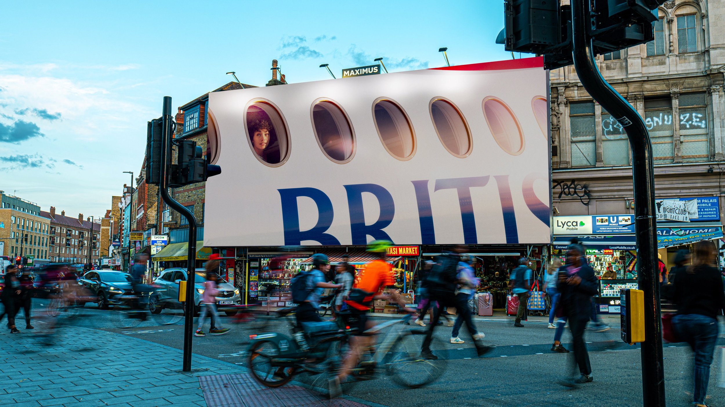
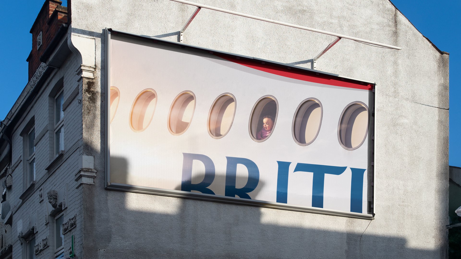
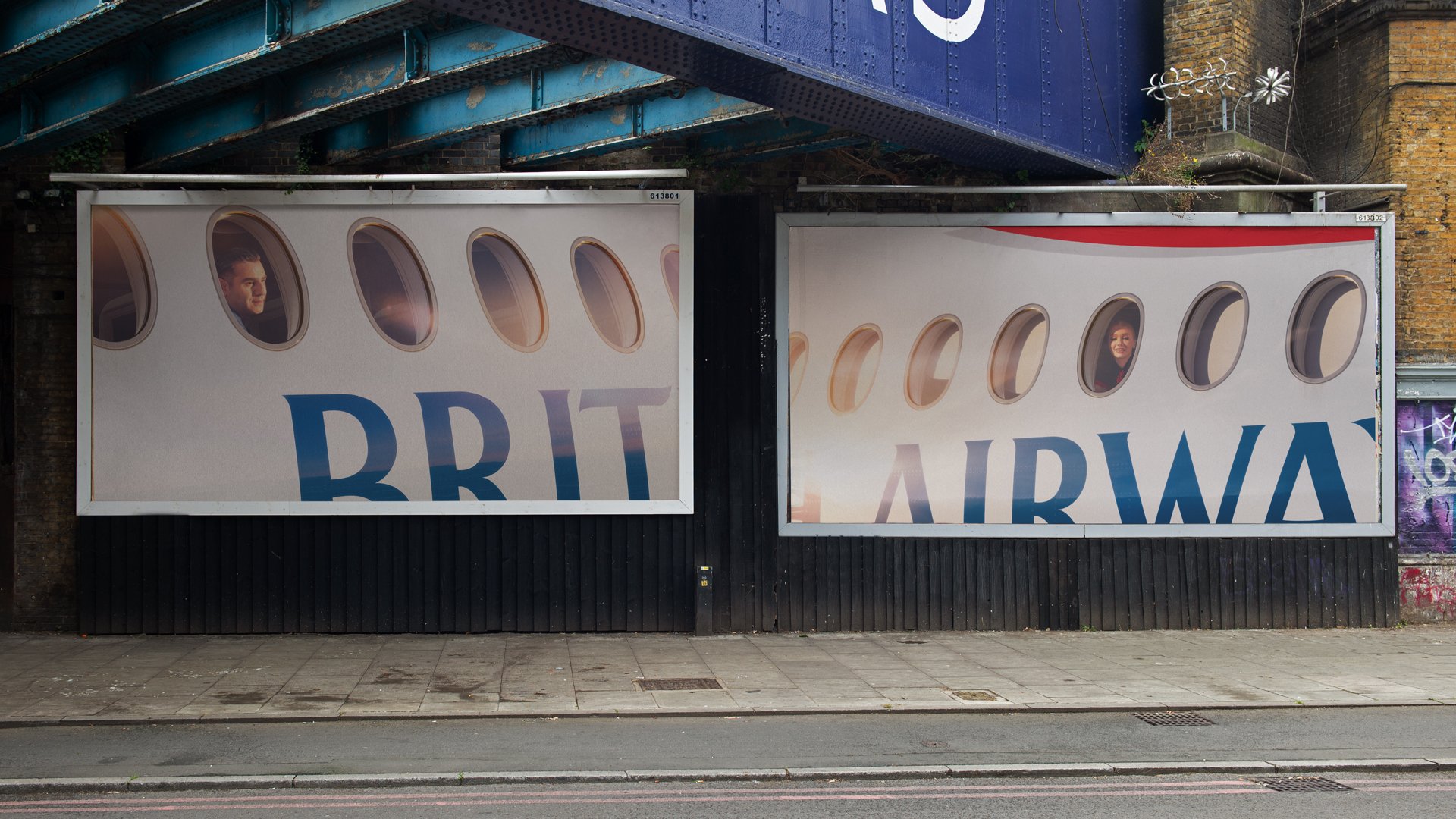
Love this campaign by Uncommon for British Airways. It’s a perfect example of how to use your brand when it’s so well-known you only need to hint at it and how to not clutter it with QR codes, URLs and other pesky things like words and CTAs.
Plus, the whole outside looking in instead of inside looking out is pretty neat too.
Unsurprisingly, it’s received its fair share of ‘this is shit’ over on LinkyDin, perhaps from those who are 100% performance folk given that the feedback is along the lines of “What does it tell me about travel?” and “Where’s the destination?” but they are missing the point as much as I’m missing St. Lucia which is where BA took me last year.
I can’t get enough of this B&Q ad by Uncommon Studio. Everything about it is just perfect. The editing, the music, the message – even down to the shadow representing death (sounds weird, watch the ad).
They’ve nailed it. It’s not the prices or the range of equipment or even the service you might receive in store. It’s about emotion. The feeling of doing something you didn’t think possible.
Brilliant.
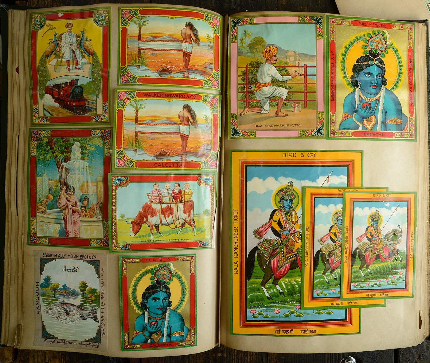
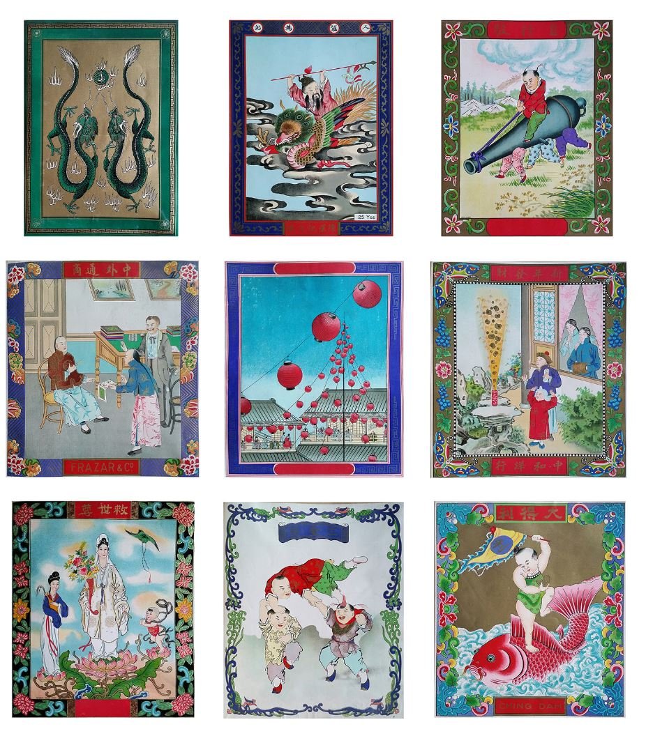
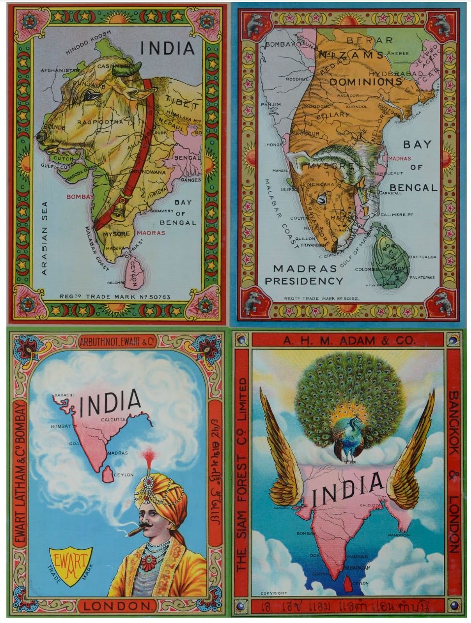
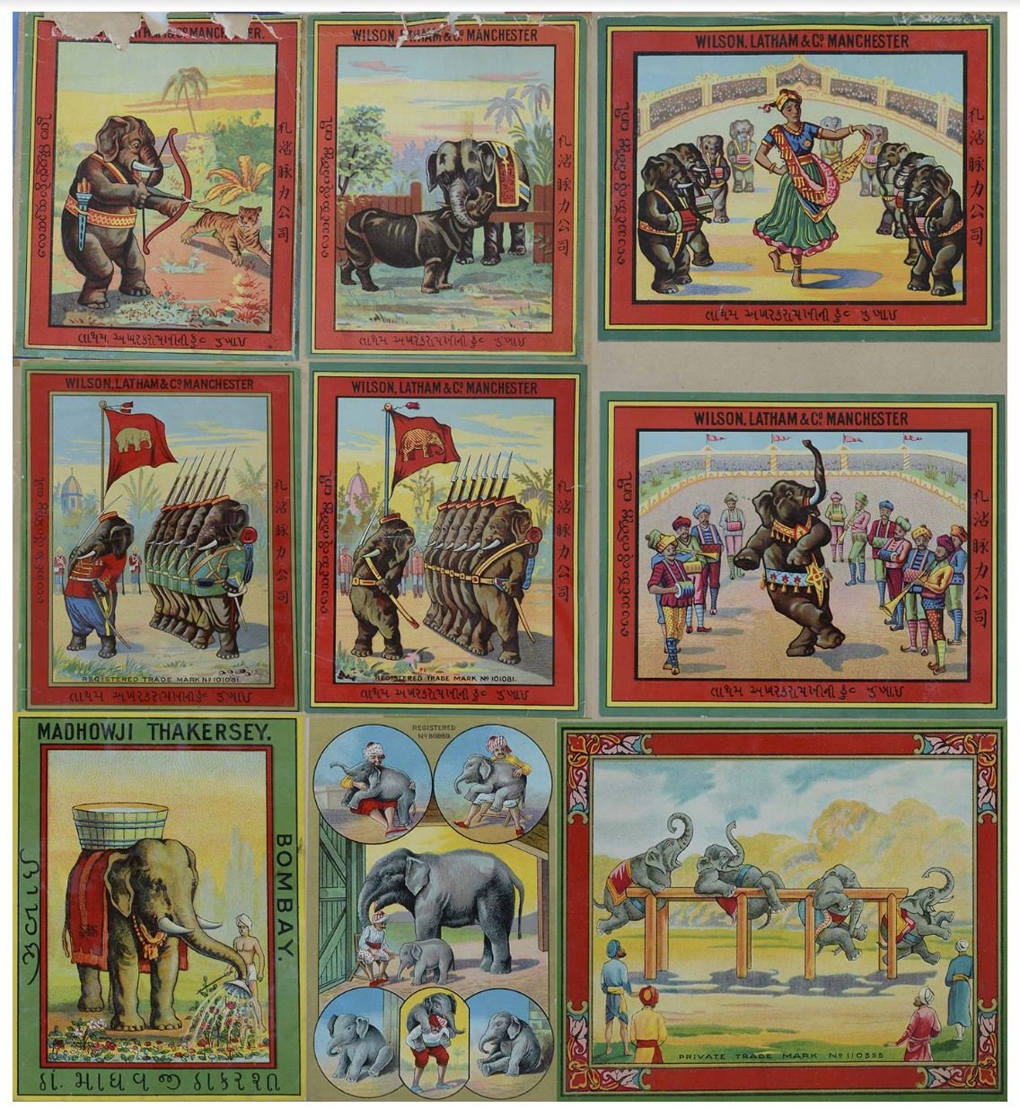
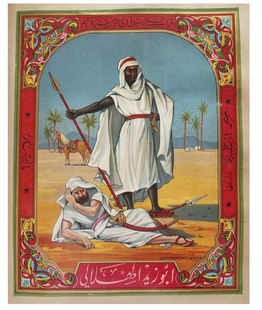
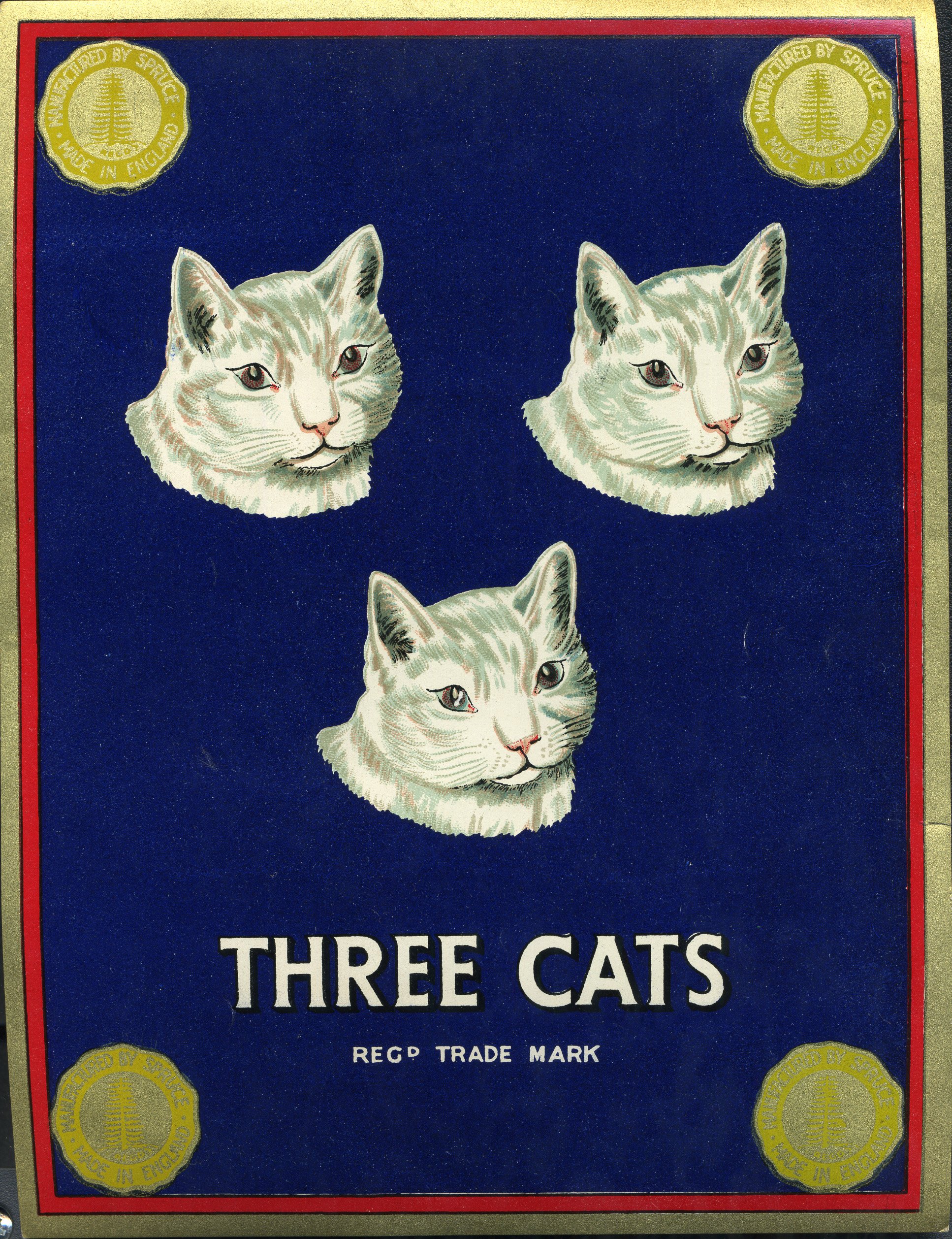
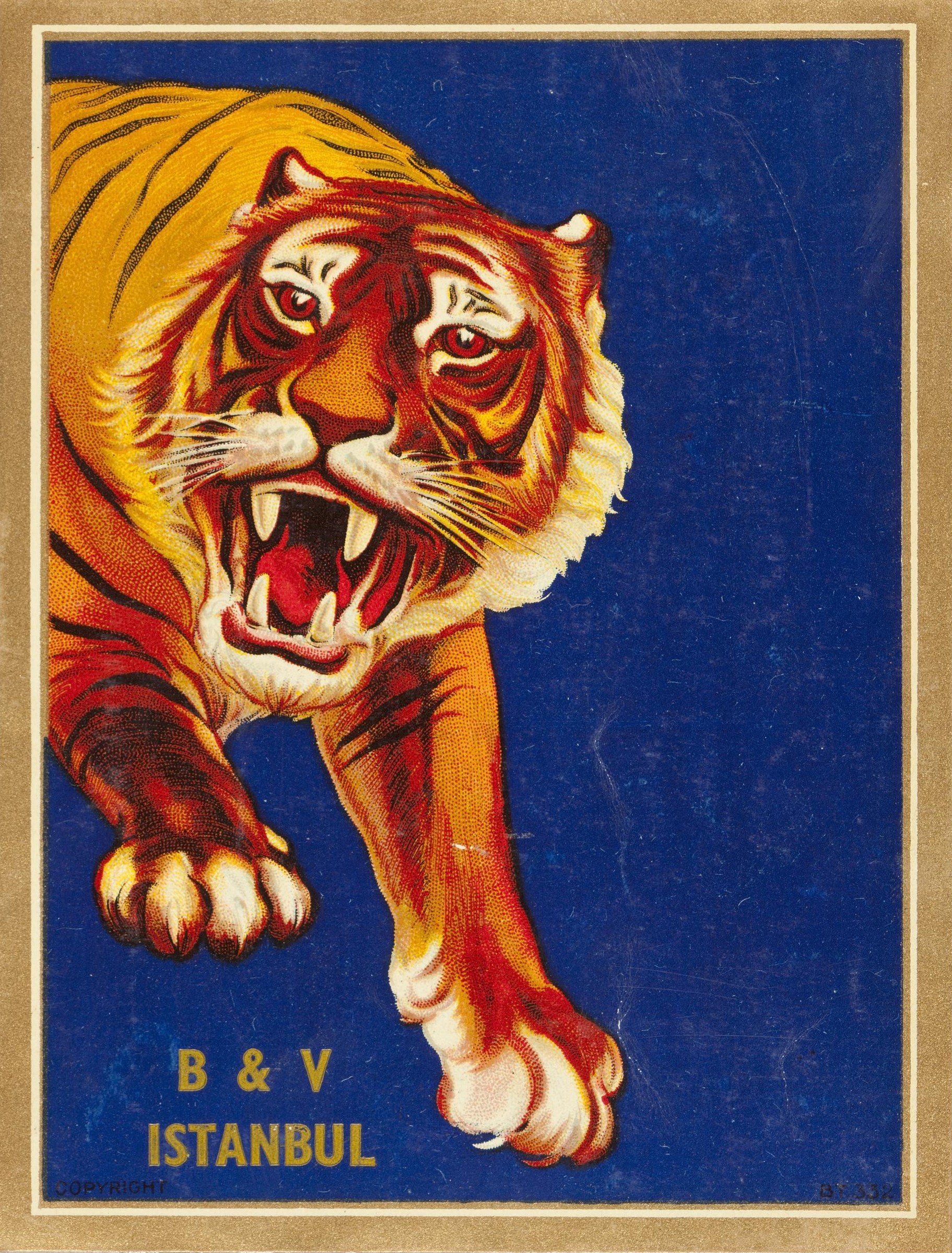
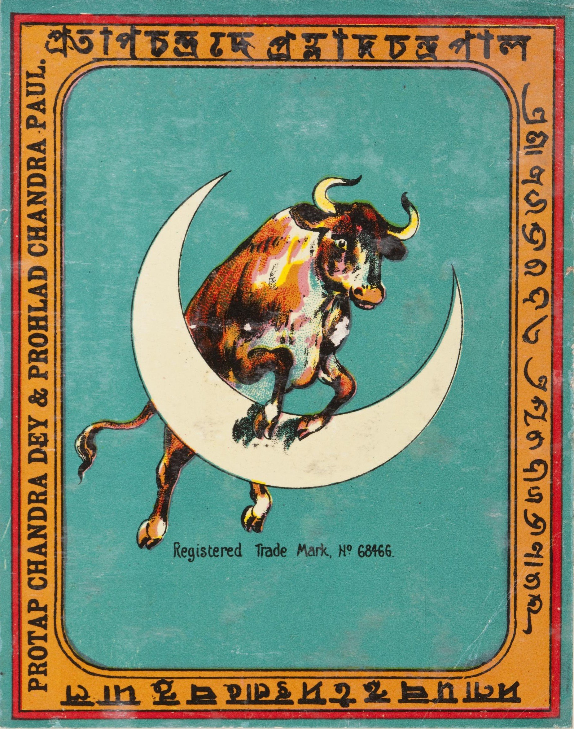
A while ago I paid an all-too-brief visit to the Science and Industry Museum and was taken in by the collection of shipper’s tickets.
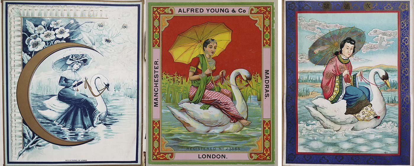
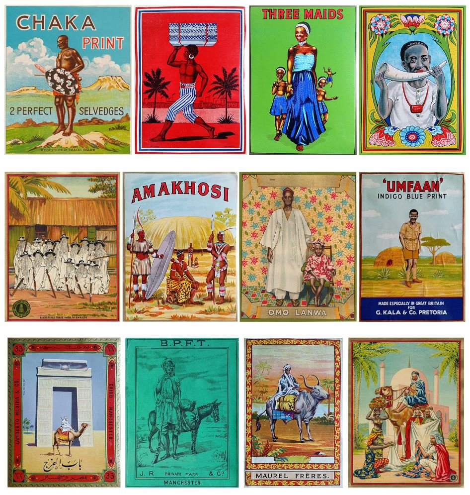
A shipper ticket was a trademark stamp each textile merchant would attach to the cloth they sold. Branding, in other words. They designed each stamp with their customers in mind, using motifs and colours they believed would appeal to them, and, of course, made their stamp unique and recognisable.
They’re beautiful.
And I must go back to Manchester.
